
Code a Responsive Website
Template version 1.2
00:00 Welcome and webinar logistics
00:59 introduction to the webinar series and New Media at UMaine
05:26 Ways to make a responsive website
Web builders versus frameworks versus CSS
Two ways to close HTML tags
Selectors, properties, and values
16:56 Web design as HTML + CSS
20:55 Outlining the major divisions
28:06 Adjusting the row heights
Applying CSS grid
Understanding viewport units (eg, 20vh)
34:52 Adjusting the column widths
Understanding fractional units (eg, 1fr)
38:15 Shrinking the title for small screens
Applying @media queries
41:50 Adjusting other text sizes for small screens
43:00 Changing the layout for small screens
46:28 Adding a grid for the menu buttons
Nesting one grid inside another
Styling the container versus items
display versus position
Being careful to complete all parts of CSS grid
This is a recording of a free webinar by the University of Maine's New Media program. For more information, contact ude.eniam@otiloppij.
Timecodes are in minutes hours
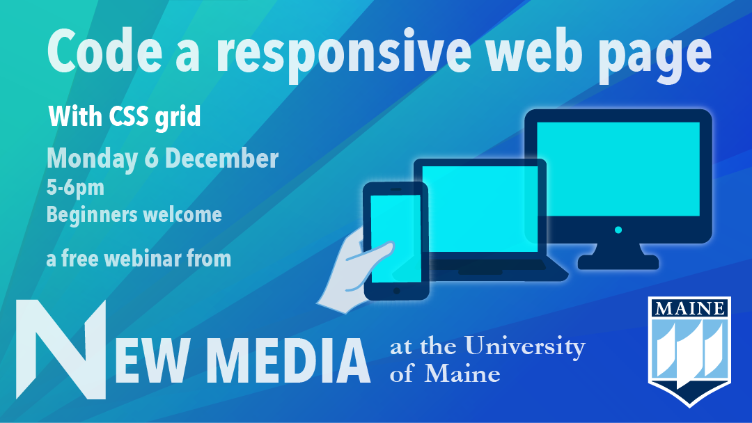
This workshop on 6 December 2021 focused on creating a web page that looks good on desktop and mobile devices. Now that 70% of web browsing is mobile, it's critical that websites work on phone-sized screens as well as 4K monitors.
This hands-on webinar walks participants through applying a powerful open standard called CSS grid that makes it easy to build responsive web pages. The beauty of CSS grid is that it allows designers to code visually, arranging descriptive words to build complex layouts that scale gracefully between large and small screens.
Conducting the workshop is New Media professor Jon Ippolito, whose courses include how to design and build web and mobile apps.
This is part of a series of free webinars on cutting-edge technologies offered by the University of Maine's New Media program, which teaches skills like animation, digital storytelling, gaming, music, physical computing, video, and web and app development. These are not Powerpoint lectures but guided demonstrations that students can follow at school or at home on their laptops. More about these webinars.
Watch the entire video or choose an excerpt from the menu on this page. (Note that the Zoom recording is a condensed, edited version of the original. The occasional glitches in the screen are artifacts of the recording and weren't present in the original presentation.)
You may also want to read a script for this presentation.