 Introduction
In a world awash with information, being able to assess data at a glance can help see the forest for the trees. In this exercise, you'll prompt an AI chatbot to produce a quantitative analysis and visualize the resulting data in a chart. Be sure to use the AI application recommended by your instructor.
💡 For better results, use the role/output/level/context/standard/structure model shown in class, and don't be afraid to ask for revisions until you're happy with the results.
⚠️ Generative AI fabricates answers based on averaging, which can result in incorrect results when there is not good data in the relevant region of its training set. While this exercise is meant only to acquaint you with the process, you should always check AI outputs for accuracy before sharing them with others.
ℹ️ Although it is possible to prompt generative AI to create images, the most reliable results will be to create the image with code, which is the approach used here.
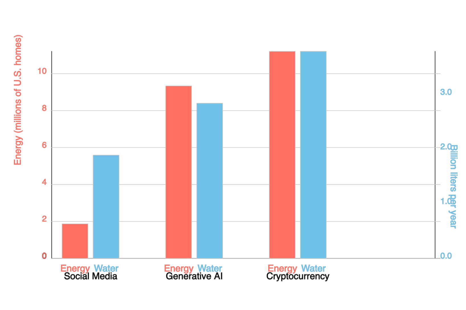
💁♂️ For an example of prompting to produce a simple bar chart to compare the environmental impact of AI with other technologies, see this ChatGPT transcript.
Gather data
- As a team, decide a research topic that requires you to compare data for more than one source. The results being compared must be quantitative rather than qualitative.
Good examples:
- ✅ Climate impact of AI versus other technologies
- ✅ Job satisfaction versus job flexibility, by genre
- ✅ Economic output (state GDP) of Maine versus California or Florida
- ✅ Future economic loss due to flooding in Maine versus California or Florida
- ✅ Hours spent studying versus hours spent in extracurriculars, by major
- ✅ Average video game price versus average playtime, by genre
- ✅ Average price of jeans versus customer ratings, by brand
Bad examples:
- ❌ Average price of electric cars (you're not comparing it to anything)
- ❌ Comparative benefits of different dogs, by breed (not quantitative)
- ❌ Best quarterbacks, by team (that's comparing within a team, not between teams)
- Prompt the AI to find real-world data on the topic, even if approximate, that can serve as the basis of a bar chart or other visualization. Ask the AI to cite sources.
🎗 Remember to add a role, eg "Acting as an expert in environmental science..."
😅 For the purposes of this exercise, just check that the sources exist; in general you should also confirm that the AI has interpreted the sources correctly.
- Prompt the AI to "normalize" these results so that the same units are reported for each of the categories being compared (eg, the water usage for social media v. AI v. cryptocurrencies is all in liters per year).
Visualize data
- Prompt the AI to write P5js code for an appropriate chart.
Sample prompt:
📌 Acting as a specialist in data visualization, write JavaScript that generates a diagram consisting of a comparison of the energy and water costs of social media, generative AI, and cryptocurrencies. Please use the P5.js JavaScript library to make the data visualization easier. You do not need to generate the enclosing HTML, only the script itself. - Open a new tab and visit the P5js editor
😅 You do not need to sign in to visualize the result, though you can if you already have a P5js account.
- Delete what's in the left hand pane and paste in its place the code generated by the chatbot
- Click the ▶️ "run" button to see the results at right.
Review and post your chart
- Review the chart in the right pane of the P5js editor, and repeat the process if you're not happy with the results.
If necessary, prompt the chatbot to add labels and numerical scales on the axes to represent better the quantities involved. ⚠️ Because generative AI often stumbles with spatial reasoning, this may require substantial dialogue back-and-forth.
- When you're satisfied, post a screenshot of your chart to #ai-visualize-data. Be sure to tag all your teammates with @, eg @mary @juan @mohamed.
